SlideShare earned its nickname “the quiet giant of content marketing” for good reason. It’s one of the most powerful, influential platforms on the Web.
Repurposing your blog content as a SlideShare deck is a great way to stretch that blog content, give new life to old blog posts, and add more value to the original blog. It helps you publish without having to create content from scratch.
Also, turning your old blog content into a SlideShare deck uses content you’ve already got to drive more traffic to your website and help you build your email list.
In this post, you’ll learn exactly how to turn old blog content into a new SlideShare deck.
Why SlideShare?
LinkedIn believed so much in the power of SlideShare to engage their readers that they bought the company back in 2012. LinkedIn CEO Jeff Weiner noted, “Presentations are one of the main ways in which professionals capture and share their experiences and knowledge, which in turn helps shape their professional identity.”
SlideShare is one of the top 100 most-visited sites in the world, with over 80 percent of its 70 million visitors coming through targeted search.
As of this writing, SlideShare’s global Alexa rank is 142. Just over 24 percent of the people who visit SlideShare come through Google.com, with another 6 percent coming in from international versions of Google.
To sum it up, SlideShare has a lot of authority.
It’s easier for you to rank for a topic in search results if you create a SlideShare deck versus a simple blog post.
(Kissmetrics makes a compelling case in their post, The Marketer’s Guide to SlideShare. This is recommended reading if you want to learn how use SlideShare for more than just repurposing your blog content.)
How to Turn a Blog Post into a SlideShare Deck
Start with a post that already performed well. This way you know it’s a hot topic for your target audience, and it’ll be easier to revive audience interest with the new visual content.
Slide decks communicate content with words and images. So blog posts that have strong visual elements more easily translate into compelling decks.
69 Experts Share 2016 Marketing Predictions by Bryan Kramer smoothly transformed into a fascinating SlideShare deck.
Educational, how-to and list-format blogs also work especially well in slide format. Your latest “Top 10 Tips” post can easily convert into a deck with one tip on each slide.
Kevan Lee wrote If Don Draper Tweeted for Buffer with a list of 27 copywriting formulas. Buffer then turned it into a slide deck with the 10 best formulas specifically for social media headlines.
Use either PowerPoint or Keynote to create your deck.
Then, plan your visuals. Check out the featured decks on SlideShare’s homepage — this will give you some inspiration and help you understand what visuals are speaking to SlideShare users right now. Recent slide trends include:
- Photo backgrounds on title slides
- Screenshots of related social media posts
- Bios within the first few slides, instead of at the end of the deck
Finally, write your copy. Take the most important points from your blog post and put them into your slides. The deck should reinforce what you’re trying to say in your blog post, and simplify the content to get the message across quickly.
Here are some things to keep in mind when you’re writing your slide deck copy:
Keep the Copy Short and Pointed
Think of your slide deck as a visual snack for your audience. Each slide should be a nibble.
Keeping the copy short is important not just because the human attention span is shorter than that of a goldfish (true story), but because how we read slides is different than how we read other forms of content. Slide decks are visual mediums.
You might have heard about the “1–6–6 rule” for creating slides. The idea is that each slide should cover one idea and include no more than six bullet points with a maximum of six words per bullet point. This post from John Zimmer illustrates how that rule can get ugly — fast.
I like the “three second rule” from Nancy Duarte: People should be able to comprehend your slide in three seconds.
Reid Hoffman used only one sentence per slide for his deck about the myths of startup financing.
No matter which rule you follow, use fewer words than you did in your blog post and make every word count. Each slide should have no more than one or two sentences, and should make a single point.
And for goodness’ sake, proofread before publishing!
Use Calls to Action (CTAs)
Using CTAs in your deck allows you to direct the reader to the next step you want them to take — read the full blog post, sign up for your mailing list, etc.
Any object or text in a slide deck can have a hyperlink. Just make sure it’s clear to the reader that the object is clickable.
- Use buttons that visually stand out
- Underline contextual links
- Use clear and active language (download, contact, get the full report, etc.)
- Use arrows if you need to!
Unbounce and Brian Clark put their heads together to create a deck about copywriting for conversion. Check out the double-whammy CTA on slide 26: an underlined link with active language in the URL.
Type Out the URL for Some Links
To make it absolutely foolproof for your SlideShare reader to see, copy and share the links within your deck, type out the URL on the slide for at least one of your CTA links.
Use a shortened URL, such as a Bit.ly link, for this.
If the embedded link isn’t working for the reader, or if they’re worried about malicious links, being able to type the link into a browser can help overcome objections and move the reader toward the next step.
Look at the last slide on Nancy Duarte’s deck about using comedy in presentations for an example of a shortened link in action.
4 ways to stretch the deck
Upload your slide deck to SlideShare and start promoting. Here’s how to stretch that deck — and your old blog content — much further.
- Post the SlideShare deck to social media
Put the deck on Twitter, LinkedIn, Facebook and even Pinterest for improved engagement with your social media posts.
As it says in Copyblogger’s SlideShare deck, The 3-Step Journey of a Remarkable Piece of Content remarkable content starts with the eyes.
Tweets with images receive 18% more clicks, 89% more favorites and 150% more retweets than those without images.
Socialbakers.com looked at the top 10% of posts made by more than 30,000 Facebook brand pages and discovered that posts with photos saw 87% of total interactions.
LinkedIn makes it easy to upload SlideShare decks to your profile page, too. Those decks can become an engaging part of your LinkedIn professional presence.
- Use the deck as a sales tool
Create SlideShare decks from blog posts that answer your customers’ frequently asked questions. This will help you illustrate your answers while giving your audience unique content they’ll remember (and share).
- Embed the deck in your website’s FAQ page
- Send customers a link when they email you with a related question
- Use the deck in your sales conversations (especially helpful when you’re on a video call and you can share your screen)
- Embed the deck on the original blog post
Embed the deck on the original blog post page for an added content bonus.
This isn’t a content upgrade in the strictest sense because there’s no email gate, but it still gives readers more value from the post. Plus, the human brain is wired to share knowledge in order to build our social currency — and delivering something new (as opposed to a typical, all-text blog post) triggers that sharing impulse.
Plus, adding a SlideShare deck to a blog post helps illustrate the information for readers.
See how Pamela Wilson did it on this Copyblogger post.
- Boost your mailing list signups with a CTA
You can link a SlideShare deck back to the original blog post so people who find the deck on the SlideShare site are driven back to your website. But you can also link it to a squeeze page or landing page to turn the deck into an email list-builder.
Include a CTA at the end, or in strategic places throughout the deck, and point the link to a page with a sign-up form.
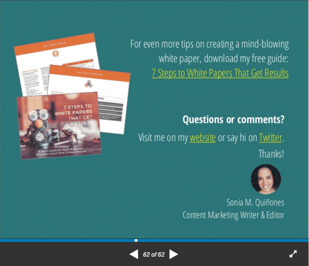
Content marketer Sonia Quinones placed a link to a landing page at the end of her SlideShare deck about creating white papers.
Make it clear in your slide deck copy what action you want the reader to take, and how taking that action benefits them.
Now Spin That Old Blog Content into SlideShare Gold
For more information about creating a great SlideShare deck, check out this post. It includes more best practices for turning written content into winning decks.
Originally posted on Medium.com.


